Today’s chosen theme: Creative Ways to Use Bold Colors in Home Decor. Dive into vibrant ideas, uplifting stories, and practical tips that make striking hues feel effortless, personal, and joyfully livable—then share your boldest room with us and subscribe for more color-forward inspiration.
Let one dominant color ground your space (60%), a supporting bold tone energize it (30%), and an accent hue add sparkle (10%). This classic proportion keeps daring shades intentional, avoids visual clutter, and gives you freedom to experiment boldly without overwhelming the room.
Borrow From the Color Wheel Like a Pro
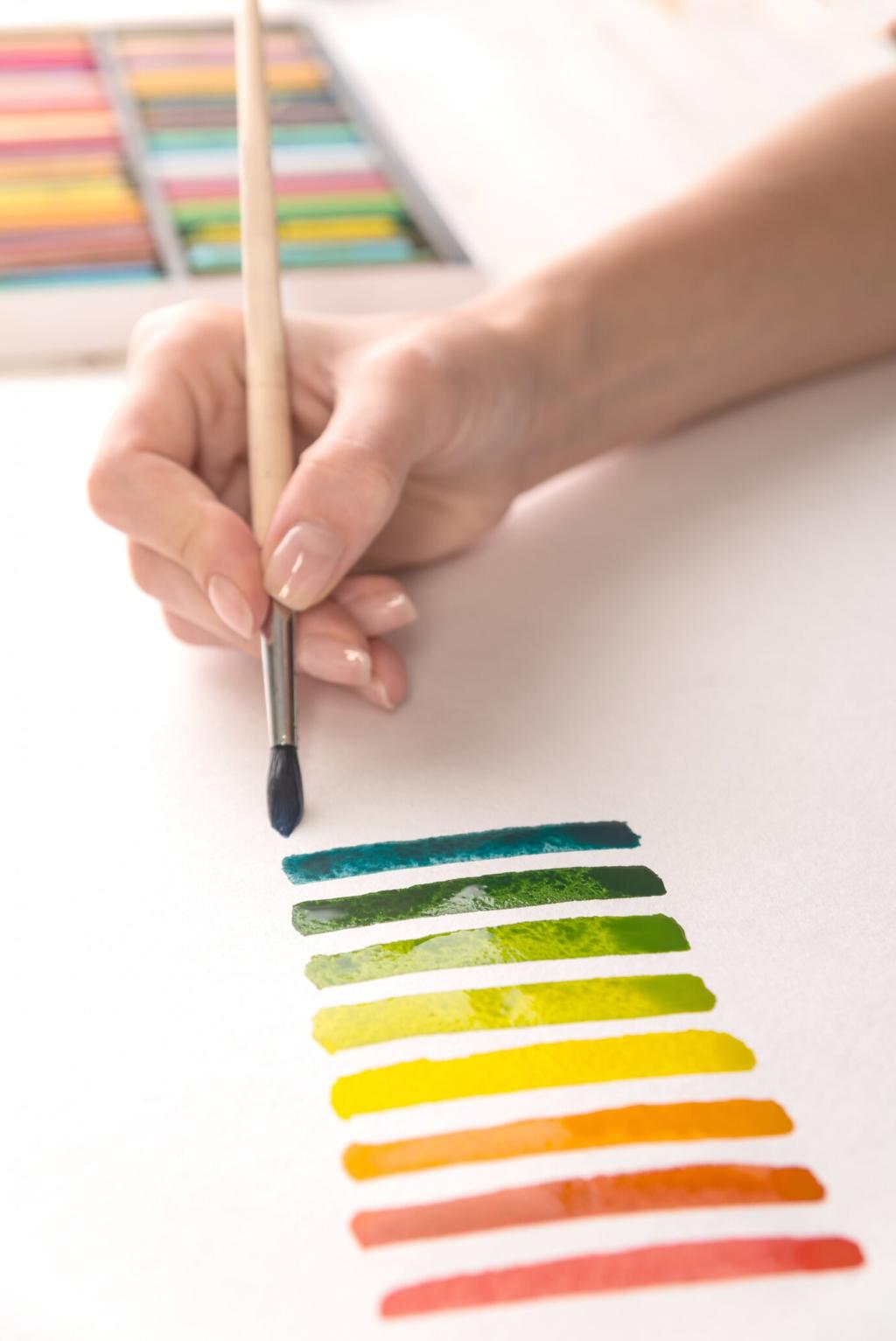
Analogous schemes feel harmonious yet lush; complementary pairings bring drama and contrast. Try cobalt with burnt orange, or emerald with chartreuse accents. Swatch on poster board, move it around throughout the day, and note how light transforms each bold color’s character and warmth.
Start With One Emotional Anchor
Choose a single item that thrills you—a saffron rug, a magenta print, or a teal vase—and let it guide your palette. This tangible anchor prevents decision fatigue, centers your bold direction, and ensures the entire decor story reflects authentic enthusiasm, not abstract theory.
The Power of a Single Saturated Wall
Paint one wall in crimson, ultramarine, or aubergine to define a zone, frame art, or dramatize a headboard. Keep adjacent walls calmer, then echo your bold shade in pillows or ceramics to stitch the narrative together. This creates daring impact with reassuring visual rhythm.
Lift the Room With a Painted Ceiling
Color above can feel like a chic secret. A matte cobalt ceiling cools south‑facing rooms, while blush brings gentle glow. Pair with pale walls and a patterned rug that nods to the ceiling color. The result is immersive, balanced, and deliciously unexpected throughout daily life.
Half‑Paint and Color Blocking
A waist‑high stripe of saffron behind a sofa, or a color‑blocked corner for reading, adds precision and play. Use painter’s tape and a level, finish in eggshell for durability, and repeat the bold hue in small accessories for cohesion that feels both modern and personal.
Upcycle With Saturated Paint and New Hardware
Revive a thrifted dresser in saffron or forest green, then swap in brass pulls for gleam. Sand lightly, use a high‑adhesion primer, and finish with durable enamel. The result feels bespoke, eco‑friendly, and becomes a magnetic focal point that silently leads your color scheme.
Paint chairs in a curated spectrum—cerulean, moss, ochre—while keeping the table neutral. The repetition of form unites diverse colors, turning everyday meals into cheerful rituals. Add napkins that echo two chair colors to create a fun, intentional bridge that looks styled, not random.
Choose prints where a shared accent—vermilion or teal—threads through the collection. Use colored mats, not just frames, to amplify your bold scheme. Hang pieces with three inches between frames for breath, and let one oversized artwork anchor the flow like a visual exclamation point.
Kitchens and Baths: Functional Color, Everyday Joy
Forest green or ink blue cabinets feel modern and timeless when paired with warm metals and pale counters. Test satin or semi‑gloss for easy cleaning. Add a single open shelf painted to match, displaying citrus bowls or bold mugs that echo the scheme and invite daily delight.
Cooler bulbs enhance blues and greens, while warmer bulbs flatter reds and ochres. Test at night and midday to avoid surprises. Place swatches on multiple walls, then photograph at different times so you remember how your bold colors perform when life actually happens around them.
Light, Finish, and the Science of Seeing Color
Matte hides imperfections and softens saturation; eggshell balances durability and depth; gloss intensifies color and reflects light dramatically. Use higher sheen on accent doors or trim to punctuate your palette. Always sample on primed surfaces to get truer reads of bold color behavior.